Jul 11, 2019
Most of my peers (including myself) never knew a time before computer aided design. I’ve listened to tales of paste-up and letraset with wide-eyed amazement. But that doesn't hold a candle to traditional letterpress. I guess there is something really thrilling about printing when you’re under constant threat of having your fingers crushed in a two-ton press.
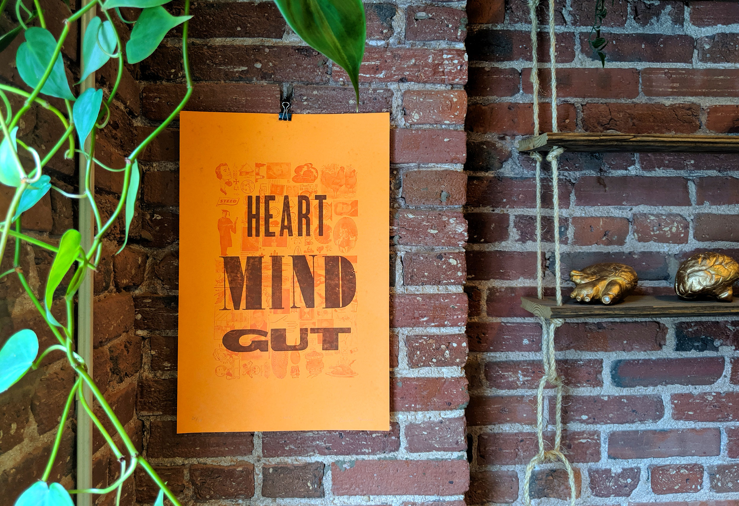
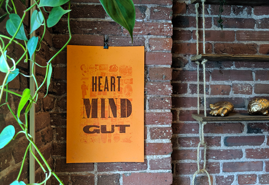
Since I have a personal connection with the owner and operator of a letterpress shop, I have been lucky enough to risk the well-being of my fingers on many occasions. When I started learning the process, I was shocked at how familiar letterpress felt. It turns out that modern design professionals use terminology rooted in letterpress printing on a regular basis. First, let’s take a look at what went into making our limited edition “Heart, Mind, Gut” print.
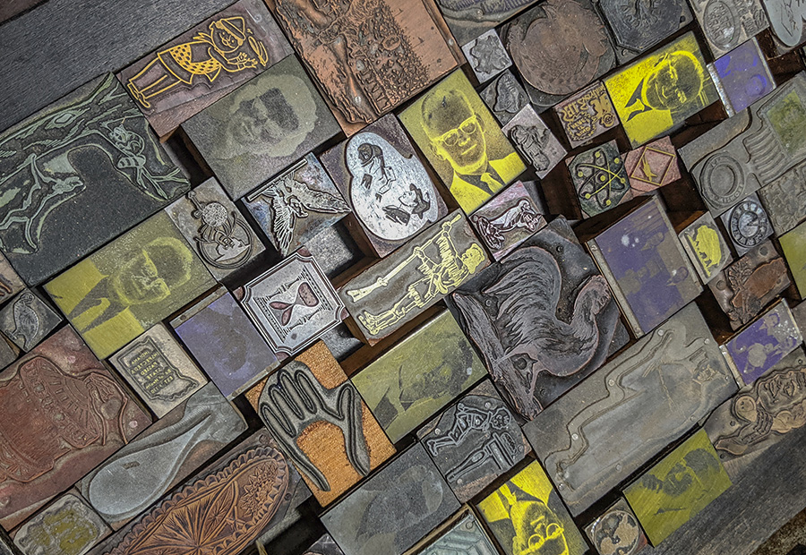
The background layer was printed with over 100 vintage cuts of illustrations, portraits, and logos. All the loose space was filled in with tiny glyphs until the lockup was an even rectangle. If you like Tetris, you will probably really like letterpress printing.
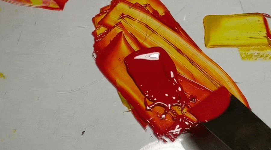
Pantone provides a formula for the selected color. Base inks are measured out and mixed. Because the ink is slightly transparent, the color looks very different on the press, and even more surprising over colorful paper (like the orange paper this was printed on).
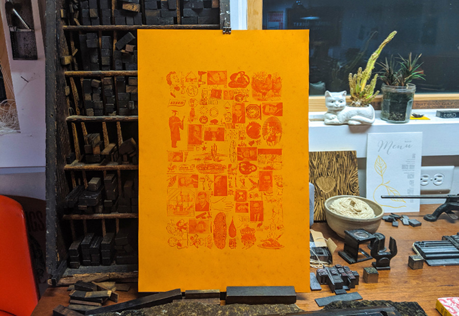
The first few prints are never quite right. Adjustments have to be made to margins, pressure, and packing on individual pieces. Once everything is perfect, the remaining paper can be printed. This print was made on a Vandercook, which was used as a proofing press back in the day.
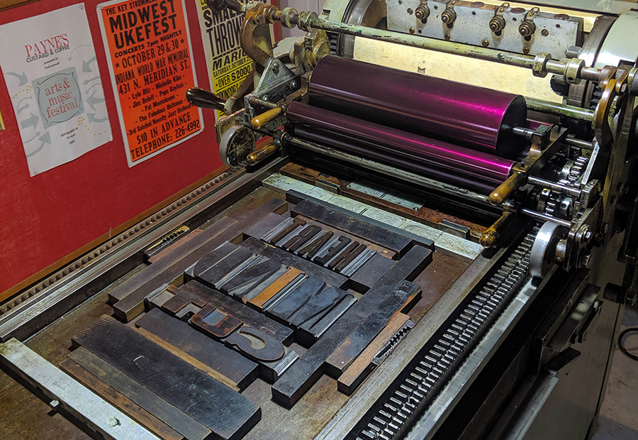
After putting everything away from the first layer and cleaning the press, large wood type is arranged into a lockup, spelling out Mission’s “Heart, Mind, Gut” mantra.
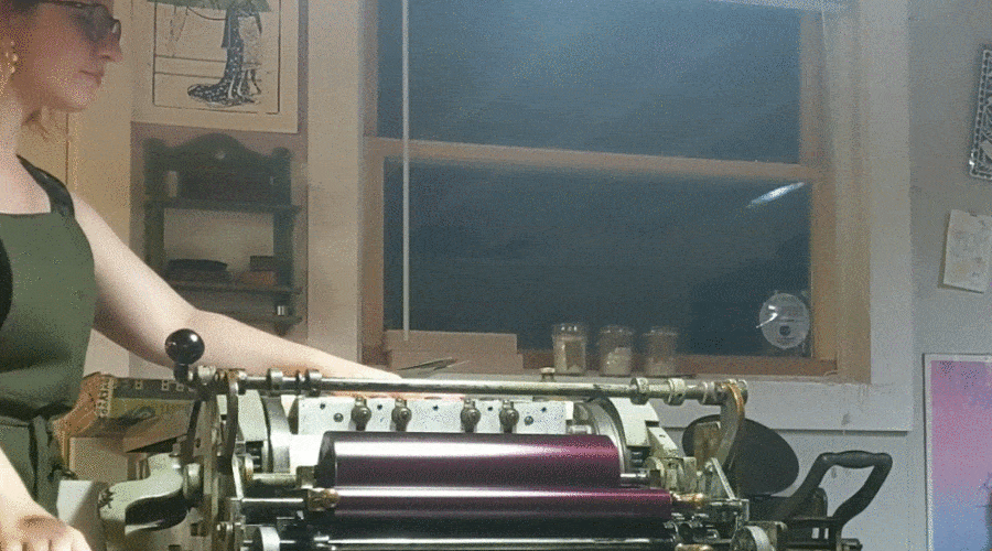
The prints from the first layer are run through the press a second time for the text to be printed on top.
I was surprised to learn that many words I use on a regular basis are actually rooted in the early days of letterpress printing.
Uppercase and lowercase originates from the way typesetter arranged their workspace. Letters were made from individual pieces of lead that were neatly organized in cases. Miniscule were used more frequently so they were kept in the lower case, which was easier to reach. Majuscule were used less frequently so they were kept in the harder to reach upper case. They were quite literally uppercase and lowercase letters.
In letterpress, the pieces you want to print with cannot float freely in the press. They have the be arranged in a frame (called the chase) using specialized pieces of metal and wood (called furniture and reglets) to fill in any gaps. Finally, all the elements are locked into the chase using a Quoin, which allows you to add pressure around all of the elements to squeeze them together. The end result of this effort is called the lockup.
Designers today use the term “lockup” to describe the arrangement of separate elements into a single unit. For example, this term is used when designing a version of a logo that includes a brand’s tagline. Lockups today are less literal, but still involve bringing separate elements together.
Designers adjust the leading to add or subtract space between lines of type in a paragraph. This is also known as line height. Nowadays, designers can adjust the leading with the flick of a hotkey. But the term “leading” originated from the days of letterpress where physical strips of lead were packed into a lockup to adjust the space between lines of type.
Typesetting used to be a highly specialized skill. A typesetter painstakingly selected and arranged individual physical characters to form the words, sentences, and paragraphs that went into a printed piece. The tiny letters were set backwards and upside down into a composing stick so that the typesetter could quickly move around the shop. They had to be fast and efficient to meet deadlines and keep costs low while maintaining perfection.
What was once only possible for a highly skilled craftsman is now accessible to anyone with a computer. Technically, anyone can set type, but now when we say “typesetting” we are referring to the skillful approach of a designer that includes consideration of hierarchy, aesthetic, and best practices.
Measurement is extremely important in letterpress printing since all the individual pieces have to fit together precisely. In metal type, the M had the largest physical block, so it was used to standardize the rest of the font within a point size. One “em” is literally equal to the width of one letter M. One “en” is about half of that width. This created a unit of measurement that could scale to any font or point size.
Computerized fonts have allowed us to bend the rules a little but the em-dash and en-dash are still based on this original idea. The em is also used in CSS as a relative unit of measurement based on font size that can provide better flexibility for different screen sizes and resolutions than fixed-size units like pixels.
Letterpress used to be the standard for commercial printing. While the printing industry has moved on, letterpress is still loved for its beauty and tactile quality. As a design professional, it is always refreshing to step away from the computer, get my hands covered in ink, and appreciate the history that made my career possible.